It’s time to kick off the first home tour of 2018! I intentionally dipped back into my archive a bit to share the home in which I hosted one of my events last year (shared here). This home epitomizes everything I want to accomplish with my own in 2018 – but I also think it offers more than just great design. This home also embodies some good life lessons that I think will serve us well in 2018. Read on to see what I mean.
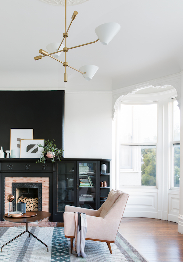
The front room of this San Francisco flat is a story of contrasts. A bold black fireplace takes pride of place in this bright white room (seem familiar to anyone??). But rather than be overly formal or dominearing, the room is softened by the mid-centry chair in blush and playful chandelier, making the space feel approachable and quite livable. The life lesson I derive from these design choices? Don’t be afraid to let your inner child out. It can be easy to get swept up in the seriousness of design, but there’s always room for a little bit of play. We do have to live in these spaces. They should certainly be a bit fun.
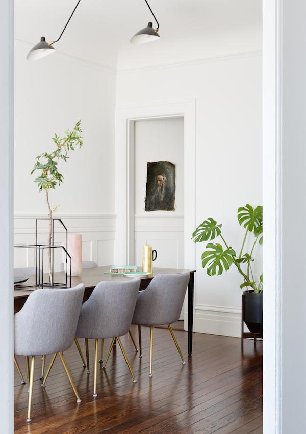
This dining room is delicious. Those warm wood floors are echoed in the dining table. The gray upholstered chairs offer a softeness. I’m all for adding a good plotted plant for a touch of life. But I really love the addition of the unframed portrait tucked in the corner. He’s unexpected. He’s worn when everything else in this room feels modern and new. He’s just that little touch of unexpected that makes a room feel personal. And he reminds that you should always have someone older and wiser in your life to turn to.
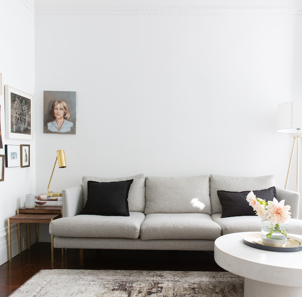
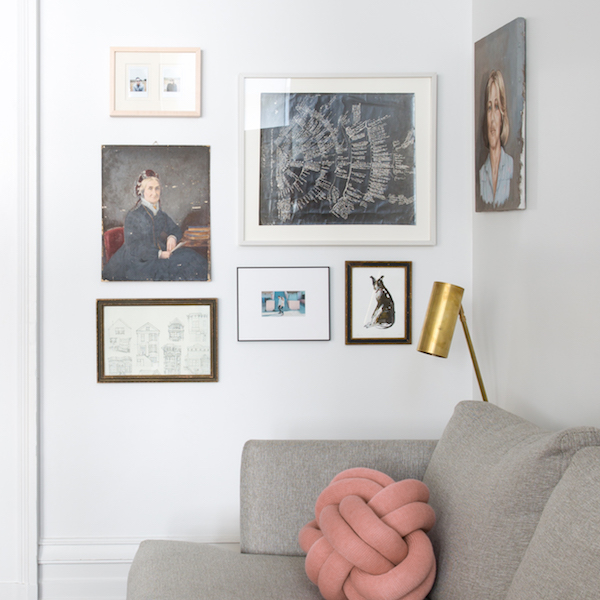
This sitting area is a prime example of editing. There isn’t too much. There isn’t too little. The gallery wall in the corner and the touch of warm brass against the white and gray feel just right. I’m also obsessed with the faded rug and midcenture nesting side tables. Yet again, all that vintage is balanced with the CB2 xx coffee table. Life lesson: seek balance. You may not always achieve it, but its pursuit is worthy.
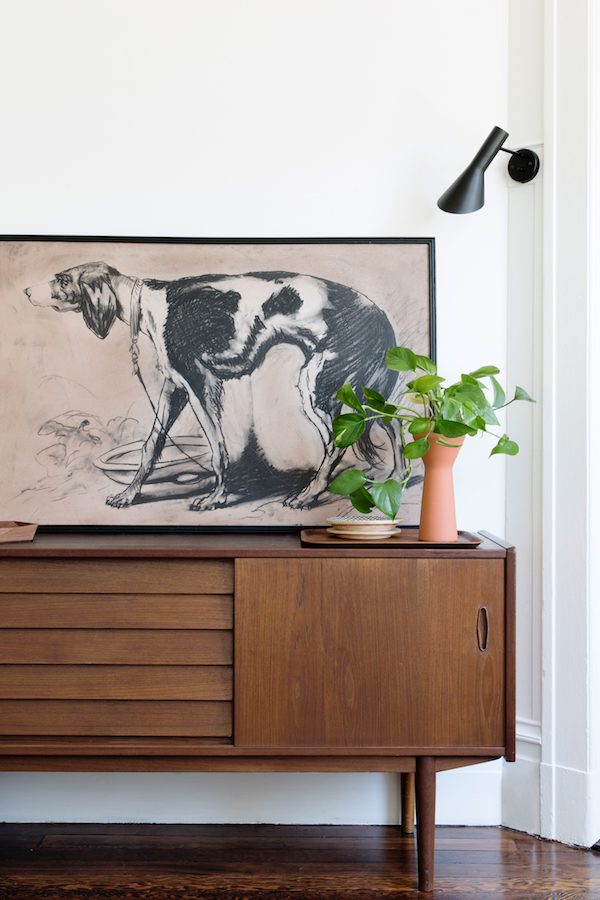
Virtually every piece in this shot is vintage. Life lesson: good things take time to find.
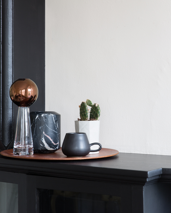
A perfectly edited collection takes pride of place on the mantel. Life lesson: only let in what fills you with joy.
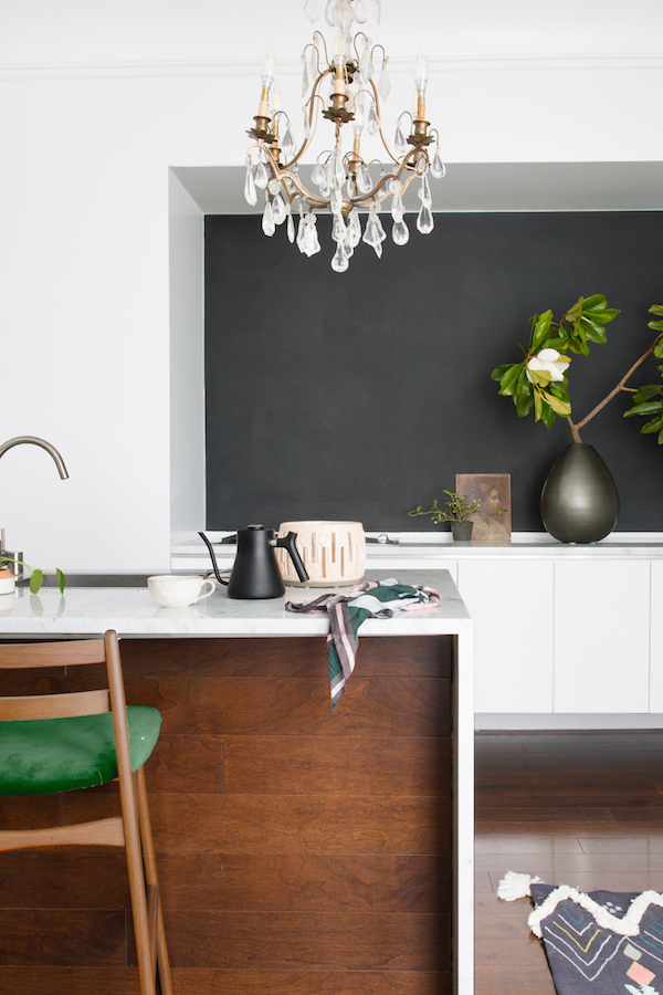
This kitchen breaks from Pinterest stream of kitchen trends. There are no open shelves. No soaring slabs of marble. No brass! The bones of this kitchen are, in fact, quite simple. A clean white waterfall countertop. Warm wood. Flat-front white cabinetry. And yet, every detail makes the space come to life. From the punches of green and shocks of black to those tiny hints of pink (did you spot them?) and that wonderfully unexpected crystal chandelier – I just want to live in this kitchen. Life lesson: if you’re feeling a little simple, put on a little something unexpected.
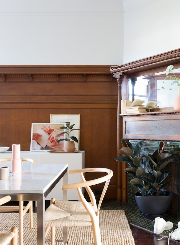
This is one of my favorite parts of old homes in San Francisco – the amazing historic details that often dominate a space. But it can be a little hard to figure out how to deal with elements like walnut picture rails and victorian fireplaces and not feel like you’re living in an episode of Downton Abbey. But this dining room proves that all you have to do is mix and match. Modern elements like a clean marble topped table and wishbone chairs feel right at home against the historic elements. Life lesson: make the old new again.
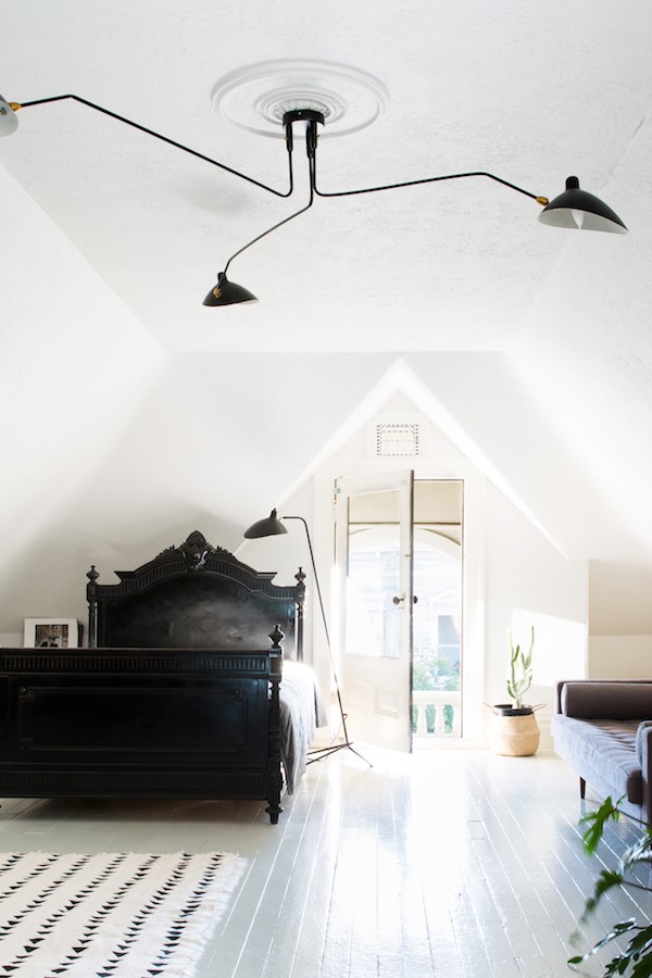
This bedroom features my color palette obsession, so its no wonder I’m in love. But it’s also a stunning take on minimalism. It’s proof positive that you don’t have to rely solely on DWR to get the minimalist look. Sure there are recognizable designer pieces in this room, but it is the ornate bed, painted black and made simply with a white coverlet that make you say wow. Minimalism never looked so good. Life lesson: be different.
I hope you’re finding as much inspiration for the new year from this home as I am. Between this and Oprah’s speech at the Golden Globes last night I definitely feel like we can head in a beautiful direction this year. I know I’m excited. Are you?
For even more design inspiration, CLICK HERE.
design by the locationist, photography suzanna scott
