Not all trends are created equal. Sometimes, good taste prevails and something timeless becomes trendy. Witness: subway tile. Has it been trendy in recent years? The answer is a resounding yes. Does that mean it will be dated soon? Definitely NO. It will continue to be a classic choice. Why? Because it is simple, versatile and just plain pretty.
Terracotta is a colour that has been popping up everywhere lately in fashion and in interiors too. After an overload of browns and earthy colours in the Tuscan trend, admittedly, many of us are not yet ready for a warm dusty orange that is almost brown.
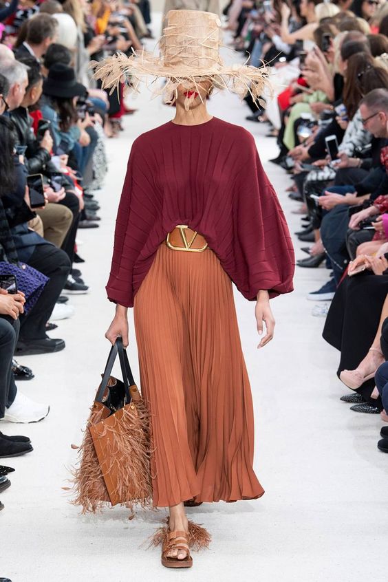
Valentino Spring/Summer 2019 from British Vogue
BUT, it’s also a material. And one with a long history in the built environment. It’s arguably a classic.
And it’s hard not to love the way the spicy colour of baked terracotta brings to mind the gorgeous patina of garden pots, patios, and Mediterranean architecture. It’s a classic material just like brick or wood.
Yet for many of us, this colour takes us right back to the 1990s when it was hot right along side all warm and earthy tones from gold to burgundy and pumpkin to sage.
If the trend is calling your name, here’s how to make it look current and not dated: mix it with lots of fresh white, greige, cream, pale beige or grey.
I think this dusty orange is here as an antidote to all the white and grey we have been living with in recent years. Like oak and rattan, terracotta, both as a colour and a material, is a rising star right now because like classic cognac leather and wood, it’s a lovely counterpoint to cooler palettes.

Terracotta accents warming up a trendy gray wood floor Source
It’s really kind of an extra punchy and warm neutral which is what makes it such a useful colour. (Its undertone is orange, but it’s saturated enough to be considered a colour and not quite a neutral, it just depends where you draw the line). It’s softer and easier going than clear orange, but livelier than brown.
Which neutrals can you pair it with? Off White, Cream, Greige, Green Gray, Green Beige, Taupe, and even Blue Gray or Violet Gray in some cases. The undertones that you should be careful about are Pink Beige, Yellow Beige and Gold Beige. Terracotta has a pretty strong pink/orange thing going on and when it’s more yellow, Pink Beige could be a problem, while if it’s more pink Yellow and Gold Beige might not be ideal. In general though, it’s pretty versatile.
If you mix it with large doses of olive green and brown in a room, it’s sure to feel heavy and dated, but toss a bit of this cozy hue into an otherwise fresh room and it’s beautiful.
Let’s break down the different ways you could use terracotta in your rooms.
Terracotta as an Accent
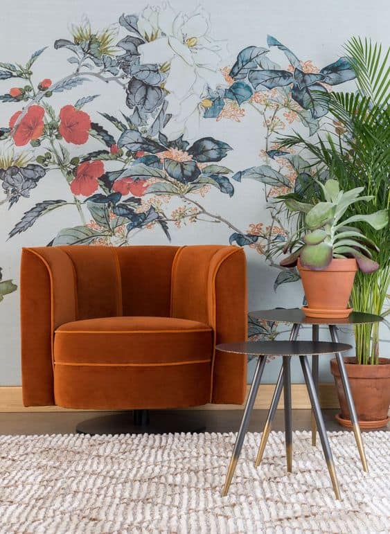
As an accent colour in furnishings, textiles and case goods, go for it, and balance it with lots of fresh white and some contrasting hits of black or dark blue. It also does very well with leafy greens.

Terracotta as a Paint Colour
Sherwin Williams hopes we will all whip out our rollers with their introduction of Cavern Clay as their 2018 colour of the year, I think it could be fun to warm up a small cozy room like a powder room or study, but honestly, as a wall colour, it would require some very clever decorating and could easily be too much, so I think the application is somewhat limited. Certainly not many of us will be using it as our main wall colour in an open concept home.
But it does look really gorgeous on the wall in this vignette below paired with soft black and cream.

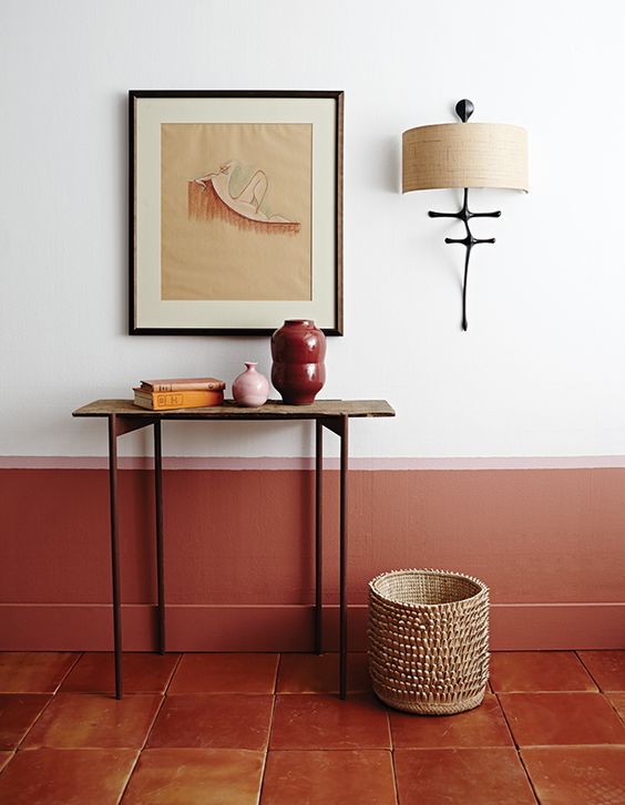
And it’s really fun how they pulled the colour of the terracotta floor part way up the wall here for a custom look and accented it with soft pink. I think this is another reason terracotta is here right now, it’s a very good compliment to the trending blush pinks and apricots. Adding a deeper version of the hue is grounding and adds depth to a pink colour scheme that could otherwise look too precious.
I’m currently debating what colour I want to recover my vintage sofa in and a washed out terracotta/apricot colour is hot in the running. It’s just so pretty.

Apricot velvet sample for my sofa
Terracotta as a Material
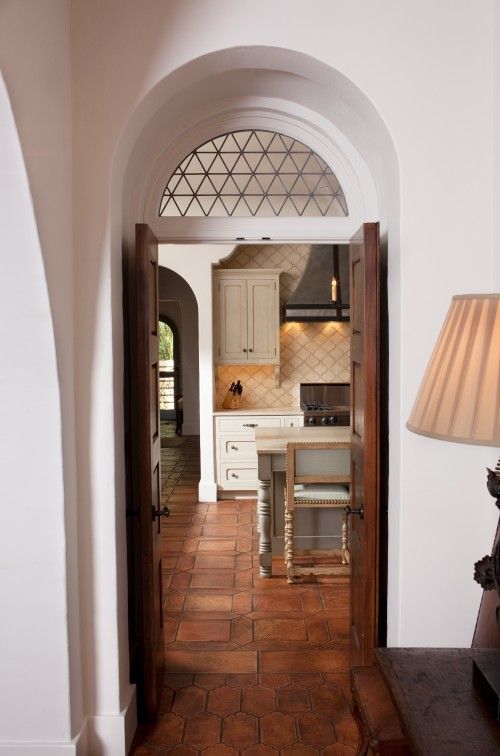
As a classic pave style floor, terracotta or saltillo tiles are absolutely classic in the right context.
Obviously, they look great in Spanish style homes like this one below.
My Google Chrome browser is currently speaking French which makes searching a French word with a particular context in English a bit tricky, haha. But, correct me if I’m wrong, a pave tile floor has the rustic look of outdoor pavers.
And terracotta or saltillo is right up there with the prettiest options for this style like creamy limestone. These types of floors are an inspired choice when you want to create some connection with your outdoor space in a kitchen with doors to the garden for example, or a mud room or sun room like this subtle, rustic room below.
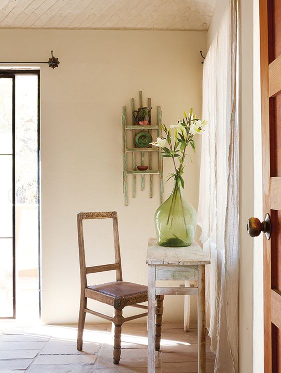
It’s fairly neutral, like a wood floor, but you would do best to repeat it at least a bit in your furnishings and decor with some warmer wood tones maybe, or some peach or blush accents.
And as it does come in a range of tones from pale orange beige or peach to deep mahogany so you can create an airier or richer look. I do think the paler ones look fresher and more current. And just like wood tones, a natural matte finish makes them look more current than a deep and glossy one.
This type of tile does tend to lend a rustic feel to a space if that is what you’re going for. It works to warm up an otherwise white or cream kitchen just like a classic hardwood floor. It’s doing just that in this kitchen below and also connecting the space to the garden.
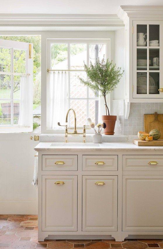
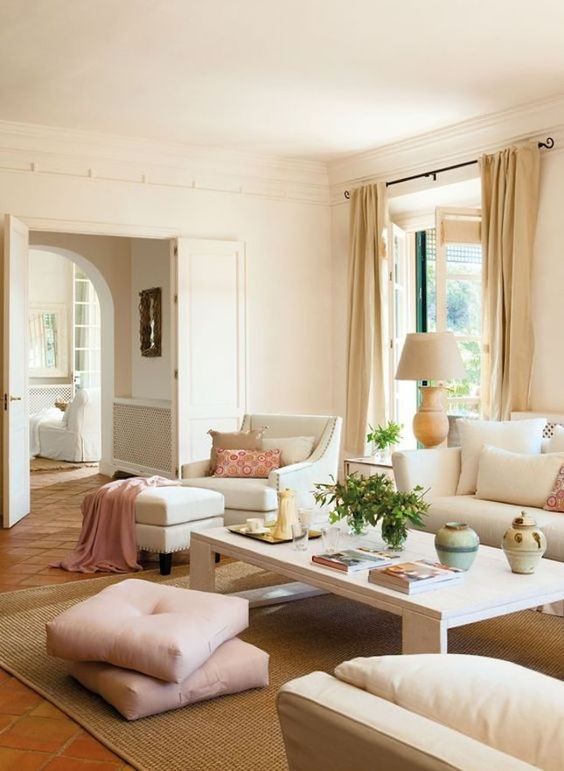
This terracotta floor (above) looks like it has been there forever and it was well handled with a soft cream and blush palette.
READ Jamie Lee Curtis Thinks Expensive Skincare Is a Scam To Make Money
However, outside the context of a Mediterranean style house or a garden type setting, tread lightly with this choice. It could look forced or just plain wrong in a more contemporary space, or in a high rise condo with no connection to the ground for example. But if you do have this kind of house, and you do live in a warmer climate where hardwood is problematic, it’s worth considering. And if you have it already and are wondering whether you should rip it out, I hope I’ve given you some inspiration for how you could make it work so you can reserve more of your budget for the fun part, decorating!
And for the rest of us, a great way to indulge in the trend is to toss it in as an accent or try it out in the powder room, it’s a cozy choice for the cooler months ahead ?
I’ll keep you posted on what I decide to go with for my sofa refresh ?
Are any of you loving this colour right now? Or considering or living with terracotta tiles? Do you feel it’s classic or trendy? We’d love to hear your thoughts.
Thanks Tricia! Here’s my Dallas class from last week!

There’s still time to attend my last course of the Fall season in Vancouver, November 28-20 here.
This post is written by my Senior Colour Designer Tricia Firmaniuk! I’m currently in Charleston finishing up my Specify Colour with Confidence here with 29 fabulous women! It was interesting because last week in Dallas, the grey trend was already OVER in a few areas. No surprise that warm colours like the one Tricia is talking about here are trending, read on to get the low down!
READ ALSO Are You Ready to Go Bold with Your Prints & Boots this Fall?
READ MORE How To Deal With Skin Redness And Rosacea
The Length Of This Finger Is The Secret To Your Personality
First appeared on mariakillam.com

